
The situation
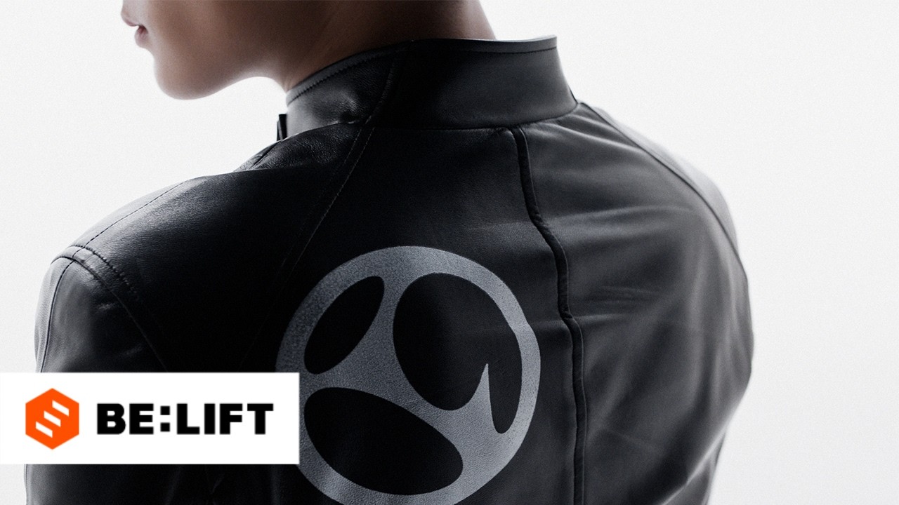
ENHYPEN released a brand renewal film, which has garnered significant attention from fans and netizens alike. The film, executive produced by Kim Taeho, features a new logo design where the "EN" is now inside the hyphen. This change has sparked various interpretations and discussions among fans.
What the internet did with it
- Netizens are analyzing the symbolism behind the new logo, with @bintemukhtar2601 noting that "the line (hyphen) is now inside the circle. It's feels like the two worlds are colliding with each other."
- The video has gained over 150,000 views in just a few hours, with fans like @Cream_K4naf-128 encouraging others to "PROVE THAT UR HERE UNDER 12 HOURS".
- Some fans, like @zuhazana17, have likened the film to a modern art exhibit, highlighting the group's experimental approach to their branding.

The open question
The meaning behind the new logo and the direction of ENHYPEN's brand renewal remains unclear, leaving fans to speculate about the group's future concept and music style. The group has not yet released an official statement explaining the significance of the logo change.
📸 Additional Photos

Top Comments from Reddit